

Illustrator Profile: Frank Viva: "Each New Yorker cover is a unique journey."
|
|
|
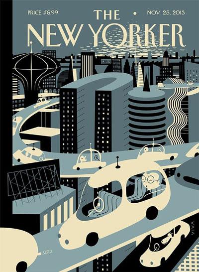
Frank’s first cover for The New Yorker appeared in 2010. Since then he’s created cover illustrations and designs that have touched on themes as diverse as Earth Day, the Olympics, and scenes from the urban landscape, and several have incorporated his love of hand-drawn typography. With simple, graphic drawings and often monochromatic color schemes, Frank’s cover illustrations create a fun, surreal almost cartoonish look, like a 21st Century fusion of the jazz LP covers of Jim Flora and Gerald McBoing-Boing cartoons.
It’s no surprise that Frank’s illustration work has a very childlike aspect to it. With the publication of Along a Little Road in 2011, he has crafted a remarkable series of children’s books. He latest, Outstanding in the Rain, will be published by Little, Brown Books in April, and he has several more in the pipeline for later this year and 2016.
Frank’s background as an art director and designer are apparent in the graphic impact of each of his illustrations. New Yorkers will recognize his recent MTA bus card that has appeared across the city on transit buses and subway cars. And while his affection for retro illustration stylings has a huge appeal to my own vintage-obsessed aesthetic, Frank's artwork remains highly contemporary and original.
MY LIFE:
I have been working at this for almost 30 years. I live in Toronto and love it here, but also have a strong connection to New York that dates back to
my art school days. In addition to working as a long distance telephone operator during high school, I flipped burgers, bussed tables, clerked in an art supply store and delivered seltzer
water on the Upper East Side. My mother was an artist–her many talents came through in things like crafts and a deep love of cooking. Her name is Barbara and after she retired, she did a
stint as “Barbo the Clown,” volunteering to cheer up kids in hospital wards. I’m very proud of her. My older daughter, Camille, finished an English degree at the University of
Toronto (U of T) and is now enrolled in a publishing certificate program. She hopes to work as an editor for a good children’s book publisher. My younger daughter, Mia, is in her
second year of illustration at OCAD University in Toronto. Both of them have way more career focus than I did at their age.
I started out as an editorial illustrator, but couldn’t make enough to pay the rent, so I took a job as a junior graphic designer at a small firm. The owner started out in the print and typesetting industries, so I learned a lot of technical things. I stayed at that job for a few years and did whatever I could to make myself useful—sweeping up, technical illustrations, marker renderings, operating a stat camera, specifying type, pasting up mechanicals and cutting rubylith. From there, I got a job as a designer at a much better studio that was doing some of the most innovative work in Toronto at the time. After that, I opened my own studio and focused on projects that involved illustration and writing. I started receiving recognition from American Illustration, Communication Arts, AIGA and other places. That helped open doors. A few years later, I partnered with a writer and for the next 16 years we built an award-winning design consultancy. Seven years ago, we went our separate ways and I reorganized the studio (now called Viva & Co.) so I could focus more of my energy on books.
MY WORKSPACE:
Viva & Co. is located in midtown Toronto on the top floor of a converted warehouse building. We have lots of natural light and a roof terrace. The studio is a supportive place populated by nine talented and very
funny people. There’s a lot of laughter so I close my office door when I need to get serious with the design of a book or a cover. Even then, I’m often interrupted by the
immediate need for a headline, a client presentation or any number of things. I thrive in this environment and if I have to stay late or work at home on weekends to keep the book
and illustration work happening, that’s okay, because I love it.
HOW I MAKE MY ILLUSTRATIONS:
I always start with a pencil sketch on paper. I try to keep
sketchbooks, but I often sneak into the print room and grab a stack of photocopy paper. Sometimes I scan the sketches and then work it digitally. Sometimes I recreate a sketch in Illustrator.
When I did a recent poster for the Gates Foundation, I used pen and ink for the first time in a long while. I’m
experimenting with a variety of new techniques.
MY FIRST BIG BREAK:
Seven years ago, I had two moments of clarity: 1) Do what you love to do without compromise.
That’s when I started work on a picture book and subsequently sent it to a literary agent. 2) Refocus the studio to include online projects in a serious way. This seems obvious now, but we made
the commitment and transition a few years before most of the local firms we compete with did, so the studio blossomed along those lines. Now, because of our track record, we maintain a
competitive advantage on that front. All of the designers can program, but we also have a senior Director of Digital projects now. We do all the obvious things like responsive sites using best
practices and the like, but, with recent advances, we’ve been able to get very close to bringing the same level of typographic excellence to online projects, that we’ve always brought
to print. We are now able to fuss about things like hanging punctuation and hinting.
MY INFLUENCES:
Lately, my literary agent has been a major influence. She has taught
me, by example, how to be a better person and to stand up for my quirky perspective on things. I feel like I’m figuring some things out pretty late in the game, but she doesn’t mind
and neither do I.
MY MOST ADMIRED CREATIVE PERSON:
Chris Ware. His books are beautiful and have broadened my understanding of what a book can be. His
covers for The New Yorker follow in the footsteps of some of the more historically quiet covers, but the moments he chooses
to illuminate, like parents dropping their young children off at school in the wake of Newtown, are quietly powerful.
He also happens to be cheerful, kind, self-effacing and articulate.
MY FAVORITE ART DIRECTOR:
Françoise
Mouly. She is my friend and a mentor. We work together on books and the occasional cover of The New Yorker. It’s difficult to pin it down to a process because everything we’ve created
together has felt like a journey with its own unique twists and turns. Always respectful of what I bring to the table, she seems to be able to get inside my head and find a way of making it
better or clearer without changing the intent. She let me write a middle grade novel for her TOON imprint with very little evidence that
I’m capable of doing such a thing. [Editor’s note: The book is scheduled for Spring 2016 release.] She is wise, tenacious, passionate and kind. A rare bird.
MY
CREATIVE INSPIRATION:
Apart from the avalanche of stuff that lands on my lap through Facebook or whatever, I keep looking at the same old crowd which includes artists like Picasso, Jean (Hans) Arp, Alexander Calder, Eva
Hesse, Bill Traylor, Martín Ramírez and Ben Shahn. After I finished high school, I took
a year off to help put out a series of derivative underground comics. Lately, I have been rediscovering the genius of the early underground pioneers. The designers at the studio also bring a
curated collection of discoveries to everybody’s attention.
A MEMORABLE ASSIGNMENT FROM THE PAST YEAR:
There have been a few. I finished a picture book for Little,
Brown & Company called Outstanding in the Rain that launches in April 2015. It includes die-cuts that
were difficult to figure out. The words are a series of oronyms (phrases that sound the same but mean different things) and piecing together a narrative using these found phrases was also a challenge.
I did an art card for the Metropolitan Transportation Authority (MTA) in New York
that seems to be getting a bit attention from riders. I’m working on an animated version of the card for the new touchscreen kiosks that MTA is placing throughout the system. I did a poster
for the Bill & Melinda Gates Foundation that’s part of a vaccination awareness initiative called “The Art of Saving a Life.” I also finished my second picture book for The Museum of
Modern Art (MoMA). It’s called Young Charlotte, Filmmaker, and comes out this fall.
DREAM ASSIGNMENT:
I’m probably working on it now. I’m convinced the world will wake up and say, “Why are we trusting that Viva idiot with all these great
opportunities?”
CREATING A COVER FOR THE NEW YORKER:
As I mentioned earlier, each cover is
a unique journey. From my end, there seems to be a bit of magic involved. I share the file with Françoise and we bat it back and forth in an attempt to get at something that’s
slippery and elusive. This suits me. When a cover comes out, it’s a miracle. I never quite believe it until I see the postage stamp
version of the cover appear at around midnight on The New Yorker’s webpage. When it gets out into the world, I hear from well wishers, readers and sometimes old friends or
colleagues that I haven’t seen in years. It’s a roller coaster and when it comes to rest, you say to yourself, “let's go around again.” So you get in line.
ON MAKING CHILDREN’S BOOKS:
Combining words and pictures in a designed context is what I like to do. From concept
to publication, books take a long time and the road is precarious. I’m very aware that there are a lot of talented people out there and not many slots on a publisher’s seasonal list.
There are also a lot of talented people working behind the scenes. On my books, these include the publisher, publicists, sales people,
librarians, teachers, and of course, my editor and my literary agent. As every bookmaker knows, you owe an awful lot to these wonderful people. If you remember to remember that fact, it keeps you
humble and helps to put things into perspective. Thanks to Maurice Sendak and others, everybody is generally on the same page: the goal is to make art—a unique combination of designed words and
pictures—that is powerful and original. Of course, you also hope that readers, young and old, will embrace the work. Thanks to precedents like Where the Wild Things Are and the
encouragement of my bookish colleagues, I know it’s possible.
HOW I PROMOTE MYSELF:
Relationships are everything. I’m not very good at social media, but I’m making a half-hearted attempt. I always enter American Illustration because I love that annual book (I want to design it one day). I enter
other competitions when I remember to, though I seem to be very good at ignoring the daily e-mailers announcing deadline extensions.
ADVICE FOR SOMEONE STARTING OUT:
Don’t allow anybody to iron out your quirks. Those are the interesting bits. I have taught a few illustration and design courses over the years. The most disheartening thing I heard was
a professor telling a student to give up after second year because she didn’t have any talent. That professor was under the mistaken impression that he was helping that student. His ego
(which was massive) got in the way of the facts. The fact is, a teacher can never know what’s in a person's heart and what they might be capable of given the right opportunities and set of
circumstances. Some people take longer to blossom. Some people end up contributing to the industry in unexpected ways. I know from my own school experiences that a good teacher can help a student
that’s struggling navigate through. I was angry with that man for crushing that student. I still am.
See more Frank Viva illustrations, new work, and updates:
Website and portfolio
All 10 of Frank Viva's covers for The New Yorker
Books
Twitter
Facebook