

Color Theory OR The Nature of Color?
Is there an artist/designer/illustrator out there who hasn’t succumbed to a gnawing sense of inadequacy when trying—very hard—to understand color theory as it’s generally taught in art schools? What ever happened to the delight we took as children when cracking open a fresh box of 64 Crayolas? Often given for an important holiday or a birthday celebration, the colors represented far more than the joy of coloring, drawing, even mural making that followed. The inability to do anything wrong with this amazing gift of color stayed with us until…well, you know what happens after middle school…
Suddenly, when we landed in art school, and sometimes even in high school, the idea of scientizing color became part of the curriculum. It seemed you couldn’t possibly make a painting unless you understood the ways in which wavelengths of light traveled from a reflective surface [paper, canvas, wall] back to your eye. Enter: The Color Wheel, Johannes Itten’s reworking of Sir Isaac Newton’s theory as filtered through Johan Wolfgang van Goethe [the color wheel story here]. A color wheel is basically a strip of spectrum colors bent into a circle [how many of us even recognized that that’s what our tormentors had done?]. Trembling with doubt, we mixed colors that looked like mud. Traumetized, we submitted to the teachings of Josef Albers (1888-1976) in the form of The Interaction of Color. Gradually, remorse yielded to revelation.
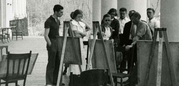
Josef Albers teaching the color class, Black Mountain College
But we really had nothing to fear because Albers was probably a big fan of crayons. Did you know that before he studied art and design (1920-23) at the Bauhaus in Weimar, Germany, he was an elementary school teacher for ten years? With wax crayons similar to Crayolas an elemental part of childhood education [crayon info thanks to Paul Hoppe] it’s safe to say he taught art using simple materials. Albers joined the Bauhlaus faculty after three years of study and created an interactive way of learning about color, which later became part of the foundation curriculum at Black Mountain College and later at Yale University Art School.
As Albers explained in his book The Interaction of Color(Yale 1963), “Though there are innumerable colors—shades and tones—in daily vocabulary, there are only about 30 color names.” [Take that, Pantone!] In his teaching, Albers created a set of simple exercises that tested student’s’ ability to think and use their hands simultaneously. From How to Be an Artist:
“As presented in the course, these exercises were essentially challenges: Can you get these colors to do this? Can you find the colors that will do that? Although Albers characterized color as ‘passive,’ ‘deceptive,’ and ‘unstable,’ he recognized that its behavior was, to some extent, predictable. His exercises therefore focused on color in specific contexts, showing that if you put color A next to color B, or these colors next to those, you could anticipate certain results. Moving from simple to complex, with many exercises exploring the ramifications of a previous one, the course awakened the students to the quirks and variables of color behavior. The course was not a fixed body of color wisdom, but rather an ongoing inquiry in which solutions were not conclusions, but steps on an endless path.”

Josef Albers in Mexico, "the birthplace of abstract art."
Steps on an endless path is the essence of art making, whether you’re an illustrator, a designer, a painter. When you look at some of the artists who first benefitted from Albers’s teaching at Black Mountain College (1933-49) and at Yale (1950-58) you’re looking at a Who’s Who roster of contemporary art including Ruth Asawa, Richard Anuskiewicz, John Chamberlain, Eva Hess, Sheila Hicks, Ray Johnson, Robert Rauschenberg, and Joseph Serra, among others. While the Pantone Matching System [1,867 solid colors!] is essential to commercial art production and design, the essentials of art making largely continues to include a reflective surface [ex: paper, canvas, wall] and pigment [ex: Crayolas, paint, Krylon] to smear onto that surface. PRreview
The Interaction of Color, 2009 anniversary editions
The Interaction of Color iPad Info
More about Josef Albers in DART