Design Omnibus: Fabulous Fonts
Next week, the Type Directors Club opens its sixty-second annual
typography exhibit, with selections from the annual typeface design competition. At a special presentation on Tuesday evening, the 29th TDC Medal will be presented to Émigré (Zuzana Licko and Rudy VanderLans), the design firm/digital type foundry that arrived in Berkeley
at the same moment as the Macintosh computer. Between 1984 and 2005, Émigré published Émigré magazine, originally a tabloid-size publication that featured new fonts in
layouts that exemplified the bleeding edge of the new digital design aesthetic, interviews with designers, and famous feuds between post-modernist and classicists graphic designers. The following
excerpt from an article entitled Ambition/Fear, in Emigre 11, 1989, offers a sense of the urgency that was felt in design
circles at the time: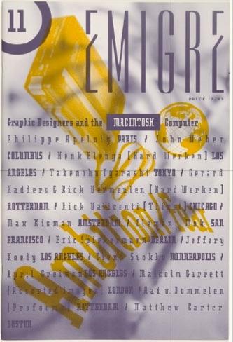
Visions of bold-italic-outline-shadow Helvetica "Mac" tricks have sent many graphic designers running back to their T-squares and rubber cement. Knowing how and when to use computers is difficult, since we have only begun to witness their capabilities.…The integration of previously isolated disciplines makes computer-aided design a seamless continuum of activity similar to that experienced by children. In fact, computer technology has advanced the state of graphic art by such a quantum leap into the future that it has brought the designer back to the most primitive of graphic ideas and methods…
This return to our primeval ideas allows us to reconsider the basic assumptions made in the creative design process, bringing excitement and creativity to aspects of design that have been forgotten since the days of letterpress. We are once again faced with evaluating the basic rules of design that we formerly took for granted….This is perhaps the most exciting of times for designers. Digital technology is a great big unknown, and after all, a mystery is the most stimulating force in unleashing the imagination.—Zuzana Licko and Rudy VanderLans, Emigre 11, 1989
TDC62, July 13-August 4. The Cooper Union, Gallery 41, 41 Cooper Square, NY, NY. Info Opening reception, July 12, 6-9 pm. Info
One of today’s most fascinating design innovators is
Dutch artist Sigrid Calon, who was originally trained in textile design, and worked as an illustrator, stylist, pattern designer and art
director following her graduation from the Academy of Fine Arts, in Tilburg, the Netherlands. Since 2005, she has worked as an “autonomous designer,” whose main focus is experimental
work resulting in a visual language based on cross-stitch embroidery. Developing a 3x3 grid as a basis for her Risographed images, she imposes a strictly observed structure on her process,
which allows for a myriad of experimental possibilities.
The foundation of her explorations, she has written, is a place where abstraction of ideas allows for concrete methods of expression in
a way that furthers communication. Her limited edition Riso-printed book To the extend of / \ | & Info 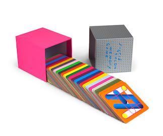 demonstrates the extent to which she has pushed the nearly unlimited possibilities of the 3x3 grid and the nearly unlimited colors possible in Riso printing to a restricted set of
parameters that result in a Pythagorean unlimited limited. Info Below:
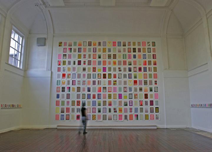
Installation of pages from the book at Goretti, Tilburg
demonstrates the extent to which she has pushed the nearly unlimited possibilities of the 3x3 grid and the nearly unlimited colors possible in Riso printing to a restricted set of
parameters that result in a Pythagorean unlimited limited. Info Below:
Installation of pages from the book at Goretti, Tilburg
Princeton Architectural Press recently released the Sigrid Calon Memory Game, a set of brilliantly hued playing cards that continue her playful exploration of the boundary of legibility and abstraction. Info This fresh interpretation of the card game, Concentration, features her signature fonts, Calon Block and Calon Speed, which are based on her 3x3 grid explorations. PAP (which published the last six issues of Émigré as hard-covered books) released Sigrid Calon Notecards last year Info and will continue the Memory Game series with a set of card by Bryan Nash Gill in his signature woodcut designs in October. Info
Subscribe to DART: Design Arts Daily here