Typography for Sopranos
Experimental typography, at its best, makes our brain do cartwheels around the notion that the medium is the message. Rather than communicating in a straight line from an original thought contained in a musical phrase, a poetic stanza, a journalistic paragraph, or a literary novel, expressive typography can create a densely packed surface in which an idea is subsumed into an emotional territory that we receive whole, then gradually unpack according to our own peculiarities.
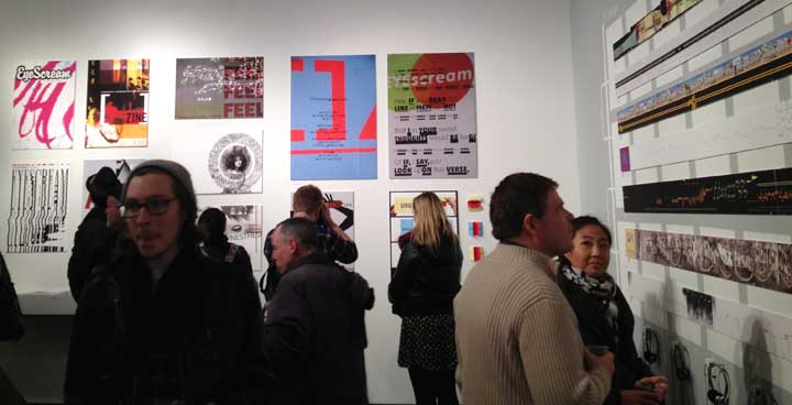
If you need to update your receivers, a show at the School of Visual Arts might be just the tune-up you need: Listening to Print, a retrospective exhibition of work made over 10 years for Olga Mezhibovskaya's typography course, is on view through February 2.
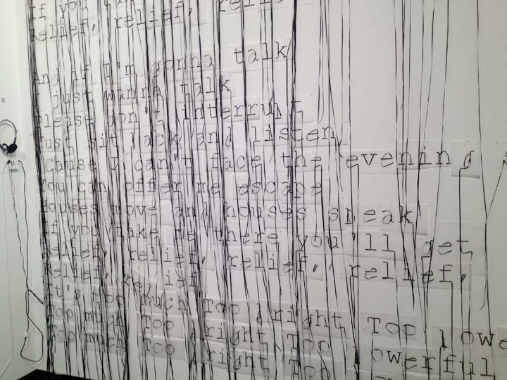
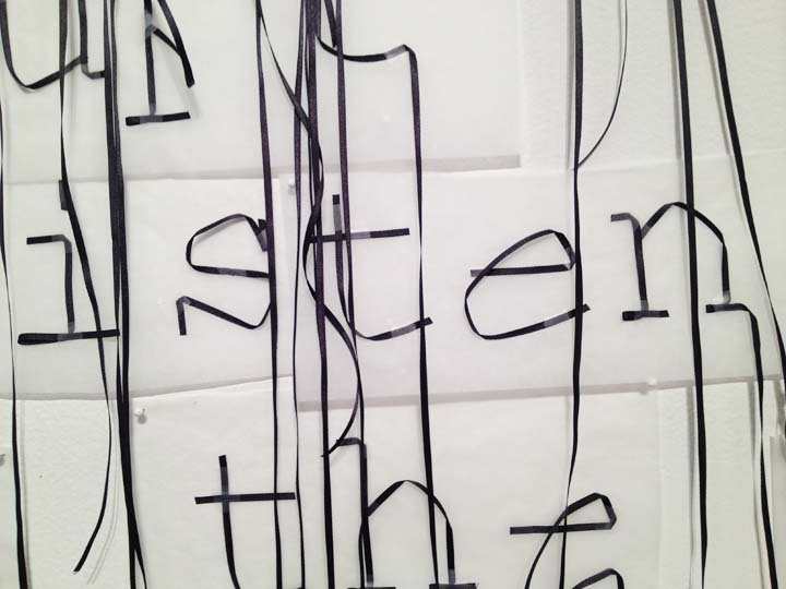
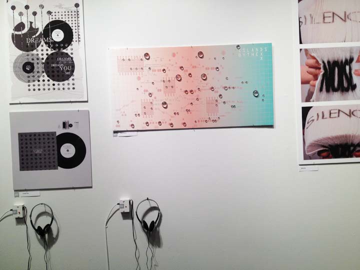
Students were asked to interpret a variety of musical pieces visually and typographically; the resulting digital prints were then interpreted musically by different musicians.
Mezhibovskaya says, “While looking at the designs of Shakespearean sonnets, plays, and poems by contemporary writers, you will hear the sound of the actors performing...but the actors will not be there. But the typographic exercises, books, posters, installations, video, motion graphics—all of which evoke and are led by rhythm, music, sound, movement, and performance—will be very much present.” See a sample of projects below
Listening to Print, presented by the BFA Advertising and Design Department. School of Visual Arts Gallery, 209 East 23rd Street, NY, NY. Information. Continuing through February 2, 2013. Hours: Monday – Friday, 9am – 7pm; Saturday, 10am – 6pm. The gallery will be closed Monday, January 21. Information.
Back in the workaday world, these blogs offer thoughtful takes on the good fonts/bad fonts debate: Fonts in Use; Typographica; The Font Feed. And you can benefit from a talk by Stephen Coles tonight at TDC. Register.