

Viktor Koen Underground
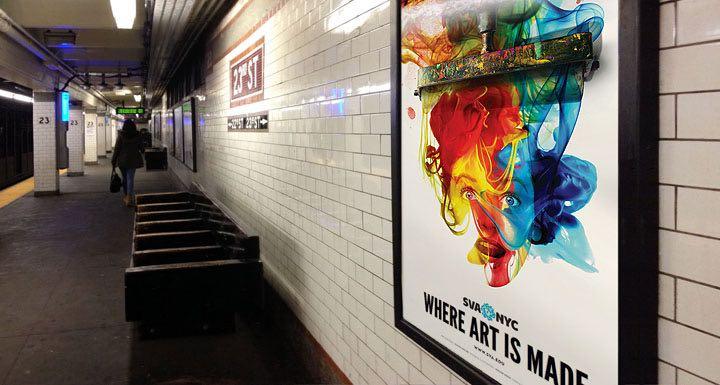
The School of Visual Art’s new subway poster is designed and illustrated by alumnus and faculty member Viktor Koen (MFA 1992 Illustration as Visual Essay) and touts the phrase “Where Art Is Made.” MFA Design Co-Chair Steve Heller, who provided art direction for the poster, says, “SVA has so many incredible offerings, but the common denominator throughout the college is, and always will be, Art. The idea behind and title of this poster exclaims that SVA is the place where art is made and Viktor captured the joy and surprise that comes from that making.” The artist explains his inspiration for the poster and describes his process in this recent email to DART:
"This spring, amid the gloom, boom, and doom action movie posters in the subway, a surprising burst of color seemed like a good idea. Mixing color splashes with ink swirls on a facial palette is an exciting yet frustrating process of blending liquids, much like cooking with gourmet ingredients—with specific results in mind but no recipe. Knowing that the impact would be delivered mostly by the expression on the face and its interaction of color, punctuated by the printmaking roller, a white background to separate the visual as much as possible from its dim environment made sense.

“Having worked with Steve for years meant expecting (and fearing) an instant, insightful and brutally honest response to anything I presented. Brutally good or brutally bad. But always looking to create a poster that does something and if not energizing, then motivating people towards action that will increase art intake in their daily diet. The Continuing Education department defines the audience for these posters—those subway commuters about to take their first step towards the arts in their widest definition as illustrated by the number and range of classes that SVA offers. This poster works on emotion, where the facial expression and fluid colors do the heavy lifting in getting the message across. Maybe I’m getting softer," continued Viktor, who cultivates a bit of vampire style in his art, "but in the depths of winter gray it seemed that an intensity of color was needed the most.
“After several weeks of sketches that varied from the historical to the bizarre, the call for an abstract representation of art making but also the excitement such undertaking generates became clear. This composition could only be accomplished by genetically fusing its ingredients through their structural DNA so the mind-blowing pigments mesh with the character.
“Splashes of swirling color have been never part of my predominantly neutral palette. But recent experiments with bright color on a couple of magazine covers that demanded such blend of effects got me hooked. And once you try it, as they say, you develop a taste for it. Just like blood."