

CBS: The Sign of Good Television
As a run-up to the forthcoming exhibition at the Jewish Museum, Revolution of the Eye: Modern Art and the Birth of American Television, DART offers a glimpse into the legendary identity design of CBS Television.
The exhibition, opening on May 1, looks at television’s facility as a promotional platform for modern artists, designers, and critics; its role as a committed patron of the work of modern artists and designers; and its programming on modern art for a broad audience. The exhibition will also examine the revolutionary corporate advertising and promotional campaigns and title sequences for films and television series created by graphic designer Saul Bass, as well as promotional campaigns for CBS created by Andy Warhol and Ben Shahn.
William Golden, the art director who created Columbia Broadcasting System’s eye symbol, launched in November 1951, created a brand image so powerful that it quickly became the identity of CBS Television in all its incarnations. Golden used Modernist European ideas about typography, photography and layout, bringing in top artists as freelancers to create advertising and promotional campaigns.
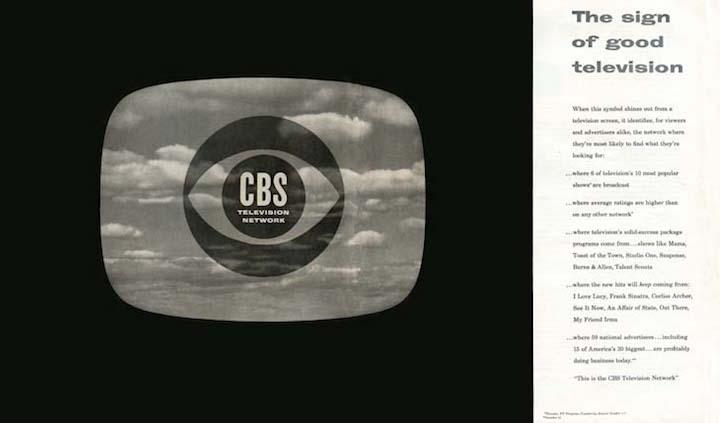
The CBS Television “eye logo”, designed by William Golden. The text reads, in part, “When this symbol shines out from a television screen, it identifies, for viewers and advertisers alike, the network where they’re most likely to find what they are looking for…This is the CBS Television Network.” CBS, All Rights Reserved.
On Golden’s untimely death from a heart attack, in 1959, Lou Dorfsman took over as Creative Director of CBS Television. In 1962 he commissioned type designer Freeman Craw to complete a typeface based on Didot Bodoni that was first drawn by CBS staffers George Lois and Kurt Weihls. Craw’s CBS Didot became the signifying typeface, not only for print and television, but also for every sign and mark in the new CBS building on West 52nd Street, designed by Eero Saarinen and known as “Black Rock.”
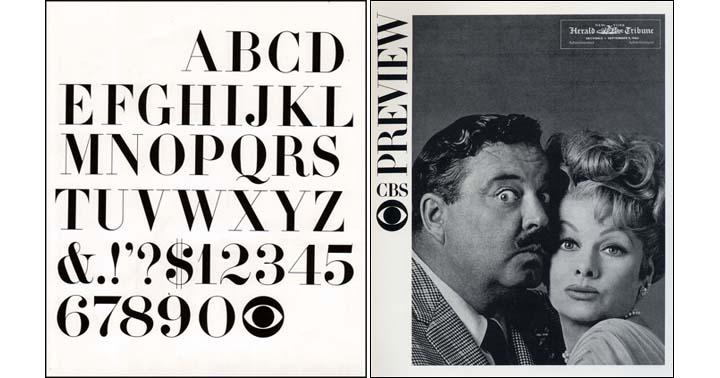
Left: CBS Didot, drawn by type designer Freeman Craw in 1962. The resulting typeface was used in CBS's identity along with all promotional materials for the company. Images: CBS, All Rights Reserved.
Alexander Tochilovsky, Curator of the Herb Lubalin Study Center at Cooper Union, contributed the following analysis of the design process for an article last year in Fonts in Use: “…I can’t really find a lot of proof that Didot was part of Bill Golden’s brand for CBS. The eye logo is on many pieces of promotion, but the typeface for CBS often changes per ad, and there is no consistent Didot-style across many ads. Not until Dorfsman is there a strong Didot presence. If anything, there’s lots of Scotch Romans.” He then added, “The other voice in all of this is George Lois, of course. Here is what he said in 1998:
SH: And you designed the official CBS typeface.
GL: Golden wanted me to re-draw Didot Bodoni.
He didn’t want people to think we just used [an existing] typeface, he wanted it to be CBS’s own. There’s nothing more beautiful than Didot Bodoni. I blew it up in stats,
re-drew it a little bit and gave it a little more style (what I thought was more style). I did six of them to show Bill where I was going – A, B, C, D, E, F. And Golden loved it and told me to
do the final pen and ink lettering myself. I did one letter a week. They were fairly easy. It was the numbers that were hard! But they turned out beautifully.” Eye Magazine, no. 29 vol. 8, 1998
Revolution of the Eye: Modern Art and the Birth of American Television opens May 1 at The Jewish Museum. 1109 Fifth Avenue, NY, NY. For now, take the American Television Survey here.